Following from our previous how-to article (read article: Creating Power BI reports with tabular models), this article will show you how to quickly create insights using data visualization in Power BI. This example mirrors the one we laid out in our article about creating Excel reports (read article: Creating Excel reports using tabular models).
Assuming you have already connected to your tabular model in Power BI, let's start by creating a new Matrix visual to show the data just as text. Select the Matrix from your Visualizations pane, and it will show up in your report canvas.

Next, add data to your matrix by dragging and dropping the following fields into the boxes in the Visualization pane, in this order:
| Field Name | Destination |
| Applicant > Admission Cycle | Rows |
| Application > Total Applicants | Values |
| Application > Enroll | Values |
| Application > Acceptance Rate | Values |
| Application > Yield | Values |
When finished, your matrix's settings should look like this:

If we look at the matrix itself in the report canvas, we can see there are some funny results due to years where there is incomplete data, so we need to filter these years from our dataset. There are multiple ways to do this kind of filtering, but the best way to minimize overhead and ensure a good interactive report is to use a slicer, so go to the Visualizations pane and select the "Slicer" to add it to your report canvas:

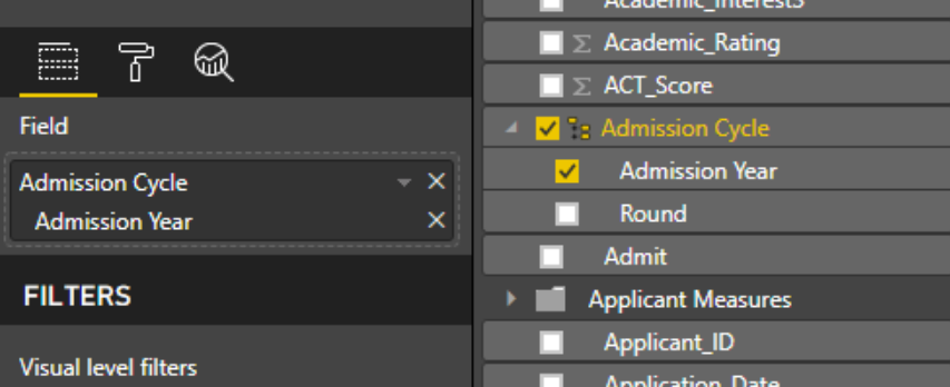
Next, add the Admission Cycle > Admission Year field to your slicer:

Your slicer will update to look like this, showing two text boxes and a slider control. This is a numeric range slicer that allows you to say "I want to see all data where the Admission Year is between these two values." It's a really handy way to filter scalar data like numbers and dates.

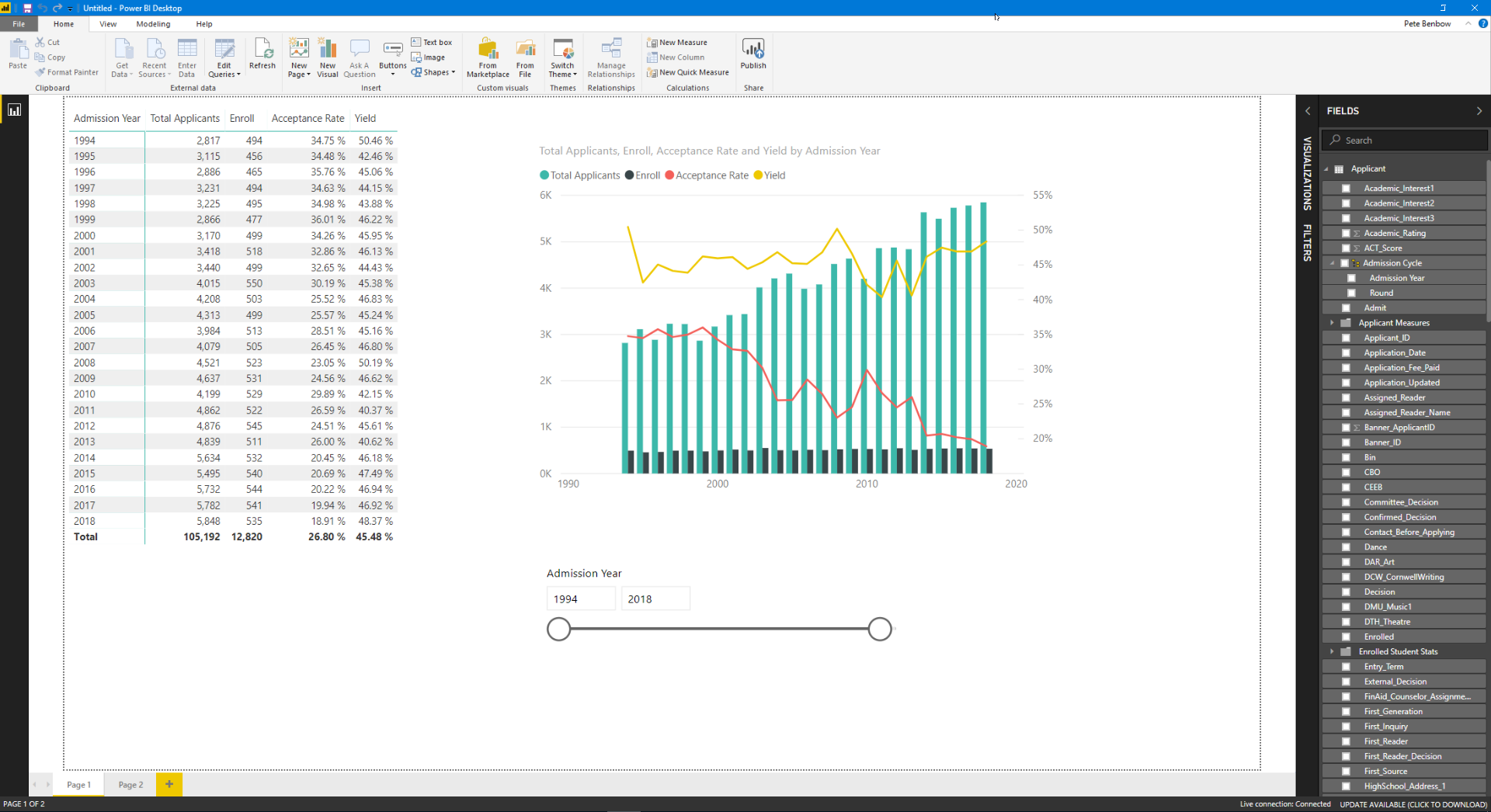
Adjust your slicer so that the dates range between 1994 and 2018. The matrix will update automatically and filter out any years that do not lie within that range:

Now let's add a chart to your report so we can see these yearly trends a bit better. Start by going to the Visualizations pane and selecting the "Line and Clustered Column Chart" to add it to your report canvas.

Next, select your visual in the reporting canvas and start dragging data from your Fields pane into the boxes in the Visualization pane. Follow this guide:
| Field Name | Destination |
| Applicant > Admission Cycle | Shared Axis |
| Application > Total Applicants | Column Values |
| Application > Enroll | Column Values |
| Application > Acceptance Rate | Line Values |
| Application > Yield | Line Values |
When finished, your chart's settings should look like this. (Note: by adding values to the "Line values" section, you are automatically telling Power BI to render those values on the secondary axis of your chart, rather than the primary axis.)

And your chart should look like this:

One of the really great things about slicers in Power BI is that, by default, they filter ALL of the visualizations that you add to a report page, so there is no need for you to restate the same filters multiple times: just add a slicer!
The end result is a nice interactive report that combines our data in both text and visual forms


Comments
0 comments
Please sign in to leave a comment.